The struggle within
SAP IBP (integrated business planning) is SAP’s latest cloud based supply chain planning product based upon the more or less successful cloud application S&OP (sales & operations planning). However S&OP wasn’t really able to set the stage for a next gen reconciliation application within the SCM area.
The main reason was for sure a lack of capabilities and the crucial need of having a cumbersome data integration in place to feed companies on premise data to the cloud. On the other side SAP SCM (APO) underwent a 20 years maturity journey having grown to a real SCM solution pretty closely interconnected to SAP’s ERP/ECC world but not being able to visualize the data in an easy and appropriate way.
That’s where companies have been stuck and usually made their way through with quite a couple of home-grown analytics apps. Most of those custom built solutions needed some heavy investments and for sure experienced experts extracting data to SAP BI and getting them visualized there.
New era
Along with SAP’s introduction of SAP HANA DB and their renewed product strategy of focussing on S/4 HANA and SAP IBP within the ERP and SCM segment brought quite some twist into the situation sketched out above. A large scale of completely new capabilities hit SAP’s customer basis and not just brought theoretical academic but real pragmatic and easy to use features such as the inbuilt advanced analytics.
SAP IBP is an outstanding role model for exactly this set of functionality offering businesses worldwide an easy to configure access to visualize their date in true real time being accessible from everywhere and anytime around the globe. The one or the other would say: “Hmmm…I already heart that quite a couple of times but in reality it wasn’t as easy that”. Therefore I prepared a small example to just illustrate how easy it got to lift your supply planning processes to the next level.
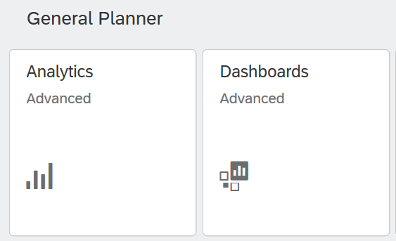
SAP offers an inbuilt advanced analytics and dashboard app which allows users to compose appealing and very helpful graphics designated for being composed to a global dashboard in order to control your supply chain.
A very important point which comes along with it is the fact that composing such graphics isn’t reserved for IT only but rather intended to be accessed by business itself within a controlled technical environment.
How to
Therefore one just needs to start the respective apps being accessible via the landing page.
The apps as such offer a very intuitive configuration screen helping business to create in a very fast and efficient way analytics by just selecting the data they intend to get compared and visualized. The system offers a great variety of different chart types to cater for the different needs of getting a fast overview.
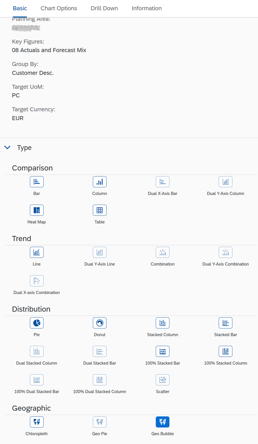
Even geocoded maps can be used based on spatial master data of locations, customers and vendors.
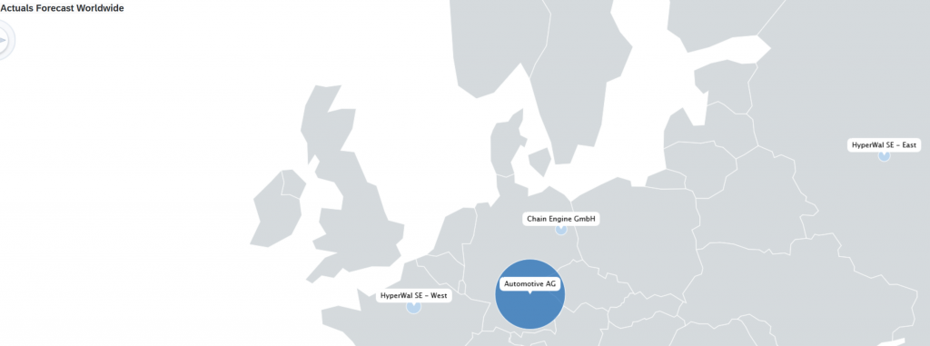
But that’s usually only the entry point to gain a holistic overview first. Furthermore in the same way like one configured this geocoded map it’s also easy to define a drilldown path to the next necessary level of detail by just clicking on one of the bubbles in the chart.
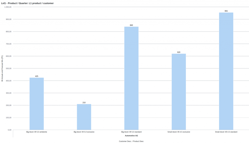
Up to 5 predefined drill down levels can be set up to analyse data in an efficient and fast way. Additionally business is not limited to illustrate the date based on those chart types but furthermore is able to change it by simply clicking on any other available type. All that happens in real time at quite an impressive speed although SAP IBP is completely cloud based.
The number of features are pretty huge but without making the end user losing himself somewhere in configuration.
At a glance
Having set up the necessary analytics is not the end supposed to be used by business operations only. It’s rather the starting point of bringing all relevant analytics and even alert overviews together in one compelling dashboard. An exercise which is even more easy than setting up the analytics themselves by just creating a new dashboard, assigning an appropriate name and adding all saved charts which should show up there. Just some setting in regards to the individual size of a chart and la voilà:
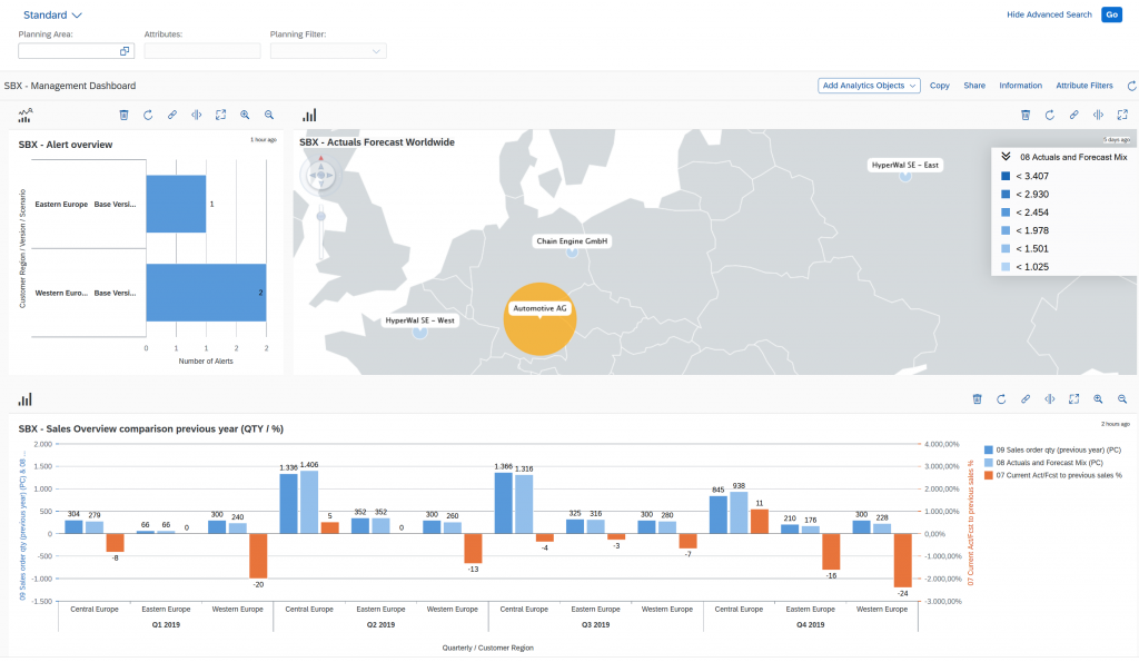
Mobility enabled – just one click away
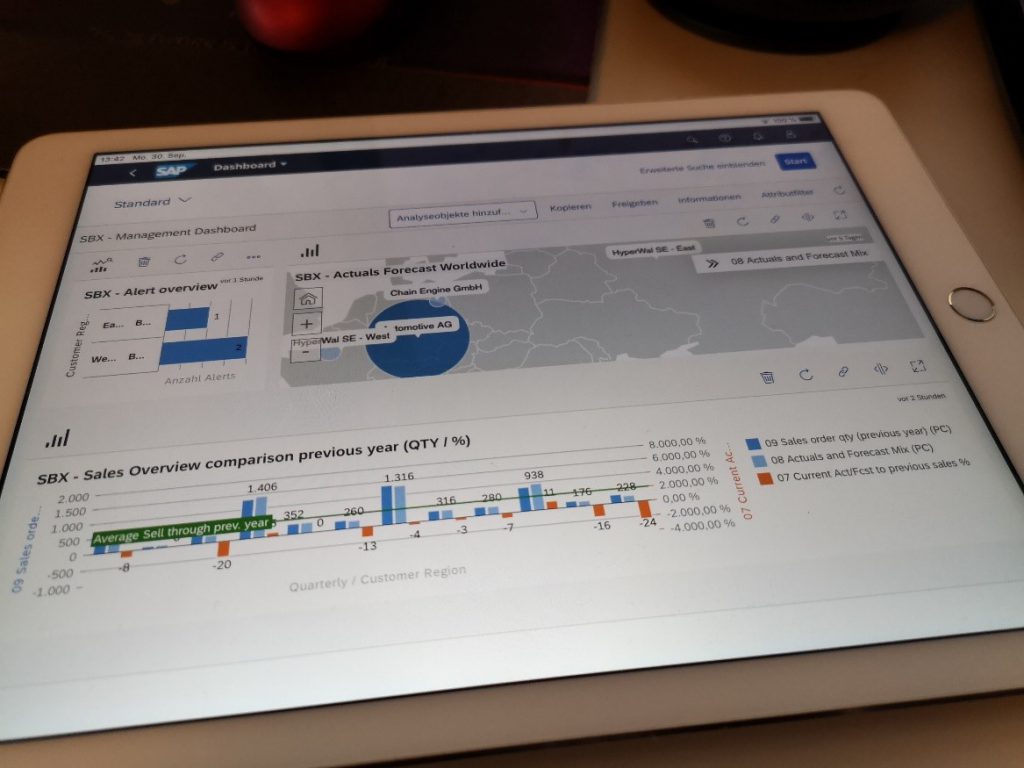
Pretty busy dashboards for sure need a big screen to unleash their full power. However getting a fast overview whenever you are on the road wasn’t as easy as now. Just get the SAP FIORI client app installed on your iOS or Android device and login to your respective SAP IBP system in order to see how your company is currently performing. There is no limiting factor…maybe the size of your portable device.
Copyright information / Disclaimer
SAP and other SAP products and services mentioned herein as well as their respective logos are trademarks or registered trademarks of SAP SE (or an SAP affiliate company) in Germany and other countries. All other product and service names mentioned are the trademarks of their respective companies. Please see https://www.sap.com/trademark for additional trademark information and notices.
Image/data in this essay is from an internal system, sample data, or demo system. Any resemblance to real data is purely coincidental and not intended.